How White Ink Works
-
02 March 2026
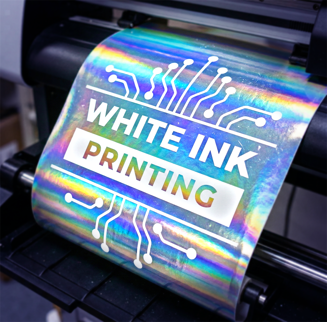
You want unique labels with metallic effects or you want a transparent background? Here comes to the scene the white ink.
Staring at a product, and feeling completely lost. Whether it is a confusing ingredient list or a beautifully designed but entirely unreadable bottle, a bad label ruins the product experience. We all have been there.
The main goal of the physical label does exactly two things: to grab attention from three feet away, and it communicates exactly what the product is about at the moment someone picks it up.
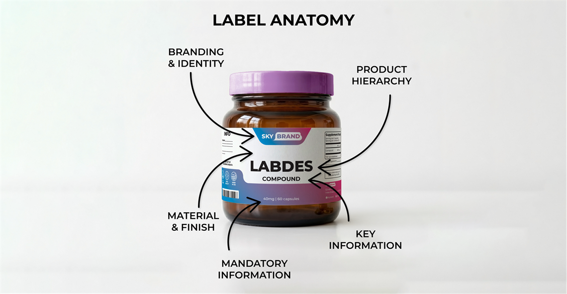
If you are designing a label or having others design for you, the digital aesthetics aren't enough. You have to design for the physical world. Here is the anatomy of a perfect label layout that actually works on the press and on the shelf.
You have about three seconds to catch a customer's eye. The biggest mistake at the beginning of their careers is that designers jump to prioritize a subtle "cool-looking" color palette over practical contrast.
If you want your label to stand out, ensure your text sharply contrasts with the background. Dark bold text on a light background and vice versa is the standard for a reason.
Before printing always ensure there is enough contrast in your design so that it won't turn out to be a muddy mess on the physical substrate. In reality screens emit light, but printers use ink. What looks bright and vibrant on a glowing computer monitor often prints darker. This is why the 2 colors modes for screen (RGB) and print (CMYK) come into play.
When it comes to typography, legibility has to come first. When designing for the medical or nutraceutical sectors, strict compliance means you are dealing with dense ingredient panels and warning labels. Stick to clean sans-serif fonts for the fine print so it remains perfectly readable at small sizes.
Your typography needs to guide the reader's eye in a very specific order, because not all information is created equal:
Brand Name —> Product Name —> Key Benefit —> Details.
Give your letters some breathing room, too. Proper tracking (letter spacing) is crucial. When your design is scaled down for a narrow-web print run, tight lettering can easily bleed together, turning a crisp word into an unreadable smudge.
The subtle border or clear framing can help anchor your design by easily navigating the viewer's eye from the main section to the secondary one.
Cramming your artwork right up to the edge of the cut line makes the product overcrowded and, in that way, looks cheap and chaotic. Embracing the white space or negative space is crucial. By providing enough space between your elements, you let your design breathe.
When setting up your file, always account for the bleed and the safe zone (also called margins). Extend your background colors at least 1/8th of an inch (0.125") past the cut line so you don't get white edges during manufacturing, and keep your critical text, logos, etc. safely inside the safe zone, also 1/8th of an inch away from the final cut.
More on bleed and margins you can find in our FAQ page.
The material you choose becomes the actual background and texture of your art.
Consider the environment your product will live in. A textured estate paper looks incredibly premium for an artisan good, but for an automotive or marine care product, that paper will quickly disintegrate. Harsh environments require durable, waterproof materials.
If you are aiming for a sleek, metallic look, printing on a Metallic BOPP can give your design an incredible, high-end sheen that standard paper simply can't match. Matching the design to the physical material is what separates amateur artwork from professional packaging.
Designing a physical label requires balancing beautiful aesthetics with the hard rules of commercial printing. Before you send your next file to the press, step back and squint at your screen.
Can you still read the product name? Is the contrast sharp? Does the layout have room to breathe? If you can answer yes, your label is ready for the real world.